
A Dynamics 365 sales dashboard is the screen your team opens least and pays for most. The default views came on during onboarding and the whole thing has gathered dust since. Reps work out of their inbox instead and managers build spreadsheets. The expensive reporting layer everyone was sold sits untouched.
That happens because the out-of-the-box dashboard was built for nobody in particular. A chart of total pipeline value is accurate and useless at the same time, since no rep starts their day wondering about the aggregate. They want to know which of their deals is about to go cold. The default view can't tell them, so they stop looking.
The platform itself does this well. Dynamics 365 holds the data model, the chart builder, the configurable list views, and the Power BI embedding to put a useful screen in front of every person on the team. But what Microsoft ships by default was built to suit a generic company that sells nothing like yours, so the standard view works as a starting point and stops well short of what the team needs unless it’s configured by a CRM specialist.
The way out is to stop pointing the whole team to one screen. A rep, a manager, a VP, and a sales ops lead each open the CRM with a different question, and a sales dashboard earns its daily open only when it answers the specific one the person came in with. Configuring those views by role is the work that gives you decision driving data.
A Dynamics 365 sales dashboard should answer a different question for every person who opens it
Gestisoft configures role-specific dashboard views for Canadian B2B sales teams so the data each stakeholder sees drives their next decision.
 Free discovery call
What a sales rep's Dynamics 365 sales dashboard should show every morning
A rep opens the CRM with one thing on their mind. Where do I start today?
The default Dynamics 365 sales dashboard answers a manager's question instead. It shows pipeline totals and activity rollups, none of which tells a rep which deal needs their attention before lunch. So they close it and go back to scanning their inbox.
What belongs on a rep's Dynamics 365 sales dashboard
- Open opportunities ordered by next activity due, not by estimated close date the way the default sorts them, so the deal needing a call today sits at the top instead of the deal closing next quarter
- Overdue follow-ups pulled to the surface, where a rep sees them first thing instead of missing them three screens deep in a list nobody scrolls
- Today's meetings with the linked deal and recent emails one click away, so a rep walks into a call already holding the client history
- Stalled deals flagged automatically, every opportunity that hasn't moved a stage in however many days your process calls too long
Most teams don’t realize that Dynamics 365 lets each rep build this personal view themselves. The catch is that hardly any rep knows the feature is there, and the ones who do, don’t know what to put on it. A short session with a CRM expert or a sales ops lead spares a rep the weeks of trial and error it takes to land on a layout that works.
Set up this way, the dashboard turns into the screen they want open because it makes their day easier. Good sales opportunity management software is meant to surface the deal that needs a move while there's still time to make it. Configure that well for every rep and you've built the best sales management software advantage from the ground up, since a manager's pipeline is only ever as current as the reps keeping it alive.
What a sales manager's Dynamics 365 sales dashboard should reveal about team performance
A manager opens the CRM looking past the individual deal and at the shape of the whole team.
- Who's sitting on opportunities that stopped moving weeks ago?
- Which deals are about to slide past the date they were forecast to close?
- Do the calls and meetings happening this month add up to enough new pipeline to hit next quarter's number?
A manager's view does its job when the signals that start a coaching conversation are sitting right there on login.
What a manager's Dynamics 365 sales dashboard should surface
- Pipeline by rep, deal count beside total value, so a rep carrying a big number across two fragile deals reads differently from one with the same number spread across eight
- Deals past their forecast close date, grouped by rep, which turns a vague sense that things are slipping into a named list with an owner
- Activity volume per rep over the last 7 and 30 days, with the calls, meetings, and emails logged, so a slow patch shows up before it becomes a dry pipeline two months on
- New opportunities created against opportunities closed this period, the in-versus-out read that says whether the top of the funnel is keeping pace with the bottom
Admins build these as system dashboards in Dynamics 365 and share one view across the whole management team. Because the charts filter by owner, a manager clicks into their own reps and the numbers redraw around their team alone, with nobody scrolling past forty other people's deals to find theirs. Pairing that with automated sales processes keeps the underlying data current enough that the view is trustworthy enough to forecast with.
The difference between a dashboard a manager glances at and one they run the weekly review from is whether it surfaces exceptions. A total pipeline figure tells a manager nothing they can do something about before Friday. A ranked list of the five deals most likely to slip this quarter tells them exactly where to spend the afternoon, which is exactly what sales planning software is meant to give a team.
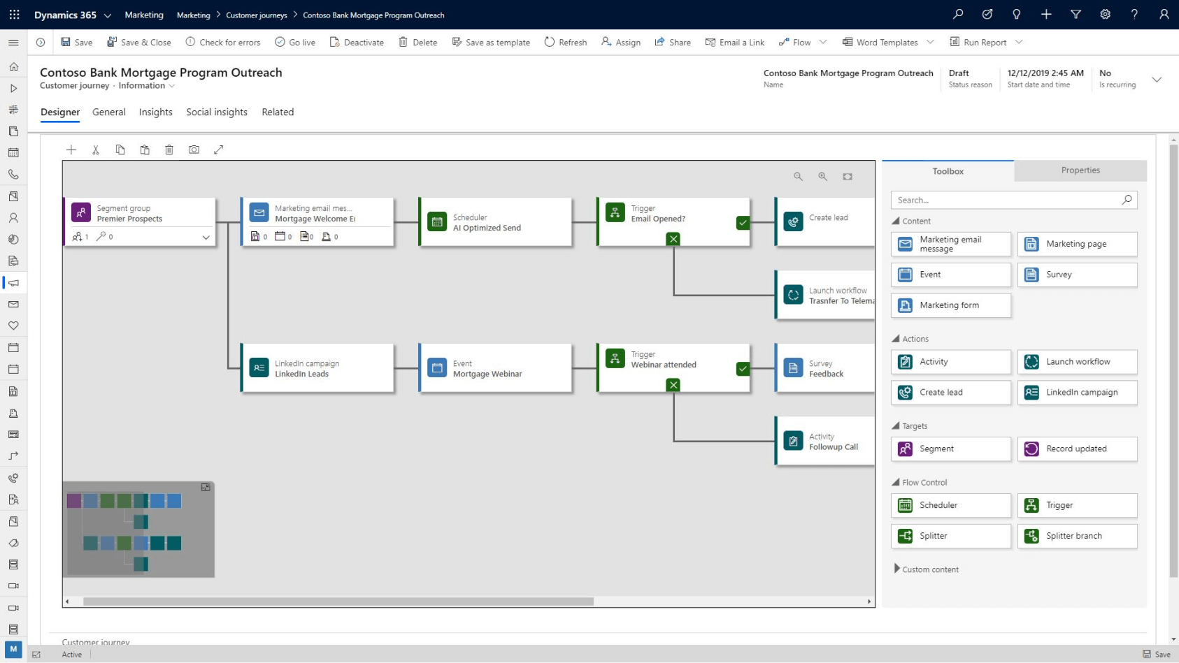
What a VP's Dynamics 365 sales dashboard should show before a board meeting
A VP walks into a board meeting with one number to defend. Is the forecast real?
The board wants to know whether the revenue the VP committed to last quarter is going to land. That answer needs the forecast tracking against what really closed and a weighted pipeline value that discounts each deal by its real chance of closing.
Why a VP's Dynamics 365 sales dashboard needs Power BI
Native Dynamics 365 charts can't render those calculations at board depth, which is where embedded Power BI comes in. A Power BI sales dashboard runs inside Dynamics 365 itself, so the VP reads the full forecasting picture without exporting anything or leaving the CRM.
A board-ready view carries a few things that a stage chart never will:
- Pipeline coverage by quarter, measured against historical conversion rates, so the VP can say whether there's enough at each stage to cover the target
- Revenue by territory or segment, which for a Canadian operation spanning Ontario, Quebec, and the West means seeing where the number is strong and where a region is dragging
- Year-over-year comparison, the context that turns this quarter's figure from a bare number into a trend the board can read
This is where the CRM and the analytics layer meet. Dynamics 365 holds the data, Power BI supplies the depth, and the VP reads both on a single screen instead of exporting to a spreadsheet. Building that connection well is the whole point of a sales performance dashboard in Power BI. It's the version a VP trusts enough to put in front of the board without a caveat.
What a sales operations director's Dynamics 365 sales dashboard should monitor for data health
Three dashboards in and there's a problem hiding underneath all of them. Every view built so far trusts the data to be right. The rep's priorities, the manager's at-risk list and the VP's forecast all assume the records feeding them are complete and current, and the moment that assumption fails, every other screen starts lying with total confidence.
That's the job the sales operations director owns. Their Dynamics 365 sales dashboard watches the data itself rather than the deals so it can catch the holes before they reach anyone else's screen.
What a sales ops Dynamics 365 sales dashboard should track
- Opportunities with no next activity booked, the deals technically alive in the pipeline that have nothing scheduled to move them
- Records missing the fields your process requires, since a forecast built on half-filled records isn’t reliable
- Stage-duration outliers, deals parked in one stage far longer than that stage usually takes is a sign that the data is stale or the deal is stuck
- Data entry lag, the days between a meeting happening and the rep logging it, because a pipeline that updates on Friday for Monday's deals is never quite true
Dynamics 365 builds these as custom list views and charts that filter on exact field conditions. An admin can create a single view showing every opportunity whose close date is already in the past while the stage still reads "Proposal Sent," and that one list hands the ops director the precise records to clean up before the weekly forecast review. A CRM implementation consultant setting these filters knows which conditions catch the errors that move the numbers.
This is the screen that’s holding the other three up. Without it, the rep is prioritising decisions off of bad data, the manager is coaching against phantom risks, and the VP is forecasting on numbers no one has checked. Keeping the data correct underneath is the work a CRM business consultant builds into the system.
Your Dynamics 365 sales dashboard should produce reliable data for every role in your sales organization
Gestisoft configures Dynamics 365 dashboards for Canadian B2B teams so reps, managers, and leadership each see the information that drives their decisions.
 Book a free consultation
Why the default Dynamics 365 sales dashboard fails most Canadian B2B sales teams
The default dashboards are built for everyone, which is exactly the problem. Microsoft ships a set of views that have to work passably for a five-person software startup and a 500-person manufacturer on the same day, so the design lands at the average of every business at once.
For a Canadian B2B operation, the misses are concrete.
Where the default Dynamics 365 sales dashboard falls short for Canadian teams
- Pipeline stages built for transactional selling, when a Canadian B2B deal moves through a longer consultative cycle
- No territory view by province or region, so an operation spanning Ontario, Quebec, and the West can't see performance the way it organises its own sales map
- English-only field labels, a daily friction for a Quebec team that works bilingually and needs the chart titles and fields to read in French too
- Forecasting hierarchies that don't match Canadian reporting lines, leaving the roll-up structure misaligned with how the business reports its numbers
Every one of these is fixable in an afternoon by someone who knows the platform, which is the entire case for a Canadian CRM configured for the way Canadian teams sell.
Knowing which of the platform's dashboard tools answers which stakeholder's question, then wiring each view to the right one, is the work a CRM software consultant does so the screen finally fits the team using it.
How Gestisoft configures Dynamics 365 sales dashboards for Canadian B2B companies
Most teams Gestisoft works with arrive doing their reporting in a spreadsheet someone rebuilds by hand every Monday. Gestisoft connects the Power BI sales dashboard layer to the live Dynamics data so the numbers update on their own, and across these implementations clients report more reliable data between departments and faster decisions because everyone is reading the same figures.
“Everything has changed! We have better tracking capability that allows us to effectively manage our leads and opportunities. Our dashboard provides us with greater insight into opportunities and outcomes.”
That breadth is what a Canadian B2B operation gets from a partner who works across the whole Microsoft stack rather than a specialist who only touches dashboards. The views read in French as cleanly as English for Quebec-facing staff and the territory breakdowns follow your provincial sales map. Your whole sales cycle is configured by a Microsoft consultant who has run these implementations for Canadian businesses since 1997 and knows what to set up before anyone asks.
Gestisoft has built this for Canadian B2B teams across manufacturing, distribution, professional services, and the public sector, so the configuration starts from a pattern that already works. A CRM software consultant who has shipped the rep view, the manager view, and the executive forecast many times over brings that experience to your build inside Dynamics 365, which is what gets a team to a dashboard worth opening every morning faster than any in-house first attempt.
-
A Dynamics 365 sales dashboard is a configurable view inside the Sales Hub that displays pipeline data, opportunity metrics, activity summaries, and forecasting information through charts, list views, and embedded Power BI reports. The platform supports personal dashboards for individual users and system dashboards shared across the organization.
Liked what you just read? Sharing is caring.

June 26, 2026 by Shelley Sunjka by Shelley Sunjka Copywriter & Marketing Strategist
Armed with a psychology degree and an irrational obsession with okapis, I've spent the last decade helping bold brands tell better stories. I believe the best writing bends grammar rules on purpose and makes people feel something. When I'm not deep in words or nerding out on buyer behaviour, I'm probably convincing my kids that impromptu kitchen dance parties are totally normal.

