

Power BI can produce stunning charts from almost any dataset. That's never been the problem. The problem is that most sales performance dashboard Power BI projects start with the visuals and work backwards, which produces a dashboard that looks polished in a presentation and does nothing to change how anyone on the team sells.
When a sales performance dashboard Power BI creates is connected to the right data and configured for the right roles, it becomes the screen your sales manager opens before every team meeting and your VP checks before making a hiring decision. One built around whatever data happened to be available becomes another tab nobody clicks on after the first week. The difference between those two outcomes has almost nothing to do with Power BI's capabilities and everything to do with what's feeding it from your CRM and whether anyone asked the right questions before the first chart was built.
A sales performance dashboard Power BI connects to your CRM changes what leadership can see
Gestisoft builds Power BI dashboards on top of Dynamics 365 so your sales data drives decisions.
 Book a free consultation
Why a sales performance dashboard Power BI builds is only as good as the data underneath it
Power BI is a visualisation layer. It takes whatever data you feed it and turns it into charts, graphs, and dashboards that look professional regardless of whether the underlying information is accurate. That's the trap most businesses fall into. The sales performance dashboard Power BI produces looks authoritative enough that people assume the numbers are right, and decisions start getting made on data that was never reliable in the first place.
If your reps aren't logging activity consistently, the activity charts won’t be accurate and when deal stages in your CRM don't match how your team sells in practice, the pipeline view is showing a version of reality that doesn't exist. Power BI will render both of those scenarios beautifully.
This is why the most important ways to improve sales performance through a Power BI dashboard have nothing to do with Power BI itself. The CRM data feeding the sales dashboard needs to be clean with pipeline stages that reflect the real buyer journey, and the team needs to be using the CRM consistently enough that the data flowing into Power BI represents what's happening in the pipeline. Get that foundation right and Power BI becomes a powerful tool in your stack.
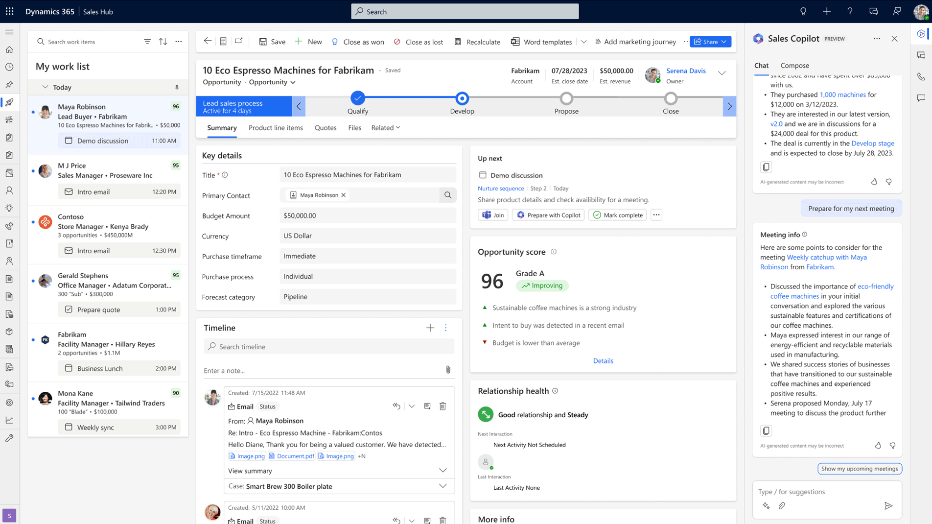
What a sales performance dashboard Power BI should show your sales manager
The sales manager's view is where a sales performance dashboard Power BI earns or loses its place in the weekly routine. If the dashboard answers the questions the manager walks into Monday morning with, it gets opened every week. If it shows a wall of metrics that require interpretation before anyone can act on them, it gets replaced by another spreadsheet.
Pipeline health at a glance in your sales performance dashboard Power BI
Your sales manager should be able to open the CRM dashboard and see whether the pipeline is growing or leaking without clicking into a single deal record. Deals by stage alongside total pipeline value and movement since last week gives that snapshot immediately. The metric most default dashboards leave out is time-in-stage, which is the one that tells the most useful story. A deal sitting in the proposal stage for six weeks needs a different conversation from one that arrived there yesterday, and flagging stalled deals automatically based on time-in-stage thresholds turns the dashboard from a passive display into an early warning system.
Team activity connected to outcomes in a sales performance dashboard Power BI
Activity volume without context is a vanity metric. A rep logging fifty calls a week with zero stage movement tells a very different story from a rep logging twenty calls that consistently convert into qualified meetings. The sales performance dashboard Power BI should connect activity data to deal progression so your manager can see which behaviours are driving results and which ones aren’t. That connection between effort and outcome is what turns a weekly pipeline review into a coaching conversation with specific evidence behind it.
Forecast vs. target in your sales performance dashboard Power BI
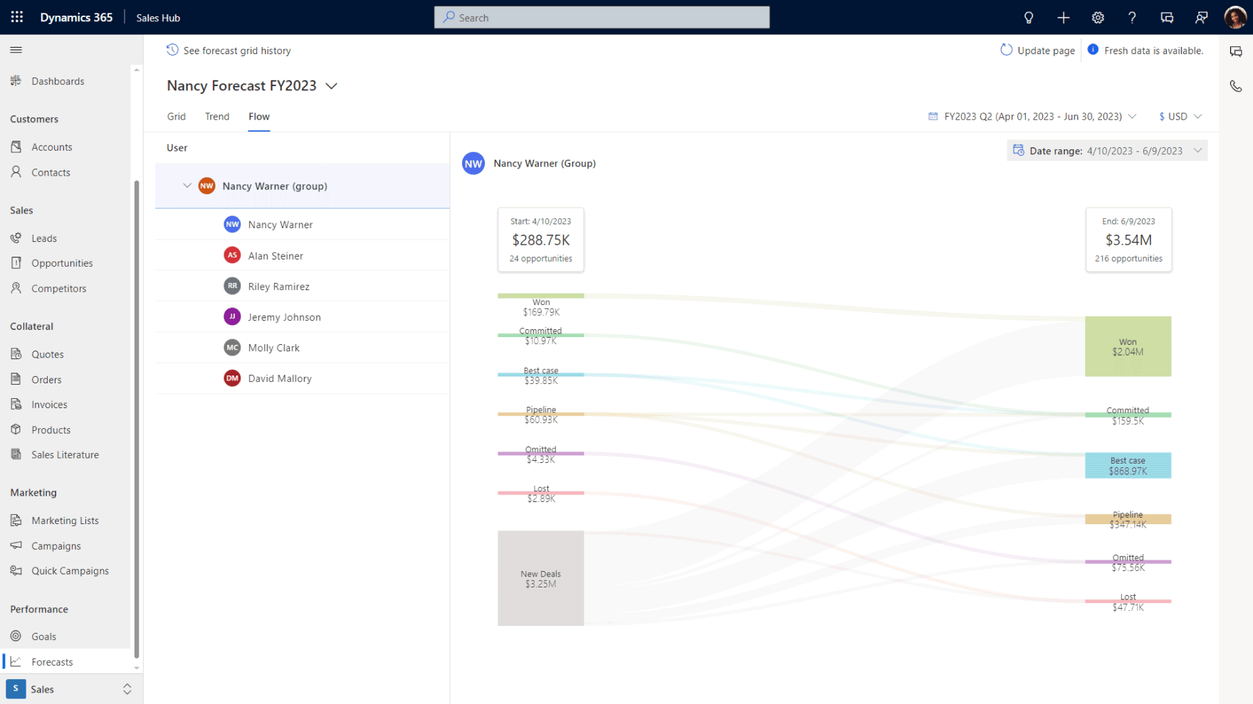
Your sales manager should be able to answer whether the team is going to hit the number this quarter without opening a spreadsheet or scheduling a meeting to find out. A weighted forecast by stage, measured against target with trend lines showing trajectory over the past several weeks, gives that answer in one view. When forecast data inside the sales performance dashboard Power BI is connected to the sales planning software your leadership uses to make capacity decisions, the Monday morning check becomes the number that the business plans around.
A sales performance dashboard Power BI that connects to Dynamics 365 shows more than pipeline
Gestisoft builds dashboards that combine sales, financial, and operational data in one view.
 Book a free consultation
What a sales performance dashboard Power BI should show your VP or executive team
The executive view serves a different purpose from the sales manager's dashboard. Your VP isn't coaching reps or reviewing individual deals. They're deciding whether the forecast is reliable enough to commit resources against. A sales performance dashboard Power BI configured for that audience needs to answer those questions directly.
How a sales performance dashboard Power BI builds for executives should show revenue trends
Your executive team needs to see whether the sales engine is improving or deteriorating over time. Quarter-over-quarter revenue alongside win rate trends and average deal size gives that longitudinal view. Sales cycle length adds another dimension because a team that's closing the same revenue but taking 30% longer to do it is showing early signs of a problem that won't appear in the revenue number until the following quarter. The sales performance dashboard Power BI builds for executives should surface those patterns early enough for leadership to respond before the impact hits the bottom line.
What a sales performance dashboard Power BI should tell leadership about forecast confidence
Pipeline-to-quota ratio tells your VP whether there's enough in the pipeline to hit the number if conversion rates hold steady. Forecast accuracy compared against previous quarters tells them whether the team's predictions are getting more reliable or less. Together those two metrics determine whether leadership trusts the forecast enough to make hiring and investment decisions against it, which is the practical test of whether the sales performance dashboard Power BI delivers executive value or just provides a more attractive version of the same uncertainty.
Why a sales performance dashboard Power BI connects to financial data changes the executive view
This is where a sales performance dashboard Power BI connected to Dynamics 365 separates from one connected to a standalone CRM. When your CRM feeds into Business Central, the executive dashboard can show margin by deal and account profitability sitting alongside pipeline value and forecast projections. Your leadership team sees how much profit might be coming, not just how much revenue.
That connected view is what most B2B leadership teams describe when they talk about what they wish their reporting could do. The reason most don't have it is that their sales data and financial data live in separate systems, and bridging that gap with manual exports or middleware produces numbers that are stale by the time anyone looks at them. A CRM specialist configuring Dynamics 365 and Business Central together can build that view natively, which is what makes the Power BI layer transformative for executive reporting.
Why a sales performance dashboard Power BI that connects to Dynamics 365 outperforms a standalone setup
Power BI can connect to almost any data source, which is part of what makes it popular. The difference when it connects natively to Dynamics 365 is that the data model is already built. The relationships between contacts, opportunities, activities, and financial records already exist inside the platform, so you're configuring views on top of a connected dataset instead of spending weeks building a data warehouse from scratch and maintaining the connections manually.
The native Dynamics 365 connector in Power BI also means the data refreshes on a schedule you control, with near real-time options available for teams that need live visibility into pipeline movement. Compare that to a setup where Power BI pulls from a standalone CRM through an API integration that syncs overnight, and the executive who checks forecast confidence at 9am is looking at numbers that are already twelve hours old.
For B2B companies running Business Central alongside Dynamics 365, the sales performance dashboard Power BI produces gains an entire dimension that standalone CRM setups can't replicate. Financial reporting sits in the same data environment as pipeline and activity data, which is what makes the executive financial views possible. A Microsoft consultant who understands both sides of the platform will configure that CRM-ERP connection during implementation so the Power BI layer has access to the full dataset from day one.
The other advantage worth noting is that Power BI embeds directly inside the Dynamics 365 interface. Your sales manager doesn't leave the CRM to check the dashboard. The dashboard lives inside the same environment where deals are managed, which means the insight and the action happen in the same place. That proximity between data and workflow is what turns a reporting tool into an operational one.

The most common mistakes with a sales performance dashboard Power BI project
The mistakes that undermine a sales performance dashboard Power BI project tend to happen before anyone opens the dashboard builder. They're process mistakes and scoping mistakes that no amount of visual design can compensate for.
Building a sales performance dashboard Power BI before fixing the CRM
This is the most expensive mistake on the list because it produces a dashboard that looks trustworthy while delivering unreliable information. If deal stages don't reflect how your team sells and reps are logging activity inconsistently, Power BI will render that chaos into professional-looking charts that leadership starts making decisions from. A CRM implementation consultant who understands this will push back on the dashboard timeline until the CRM data is clean enough to support it, which feels like a delay at the time but saves significant rework later.
Too many metrics on a sales performance dashboard Power BI has built kills adoption
The instinct during setup is to add everything the platform can display. More data feels like more visibility. In practice, a dashboard with thirty widgets overwhelms every person who opens it, and overwhelming dashboards don't get opened regularly. If your sales manager can't scan the screen in under sixty seconds and know where to focus the team's energy this week, there's too much on it. The discipline is in stripping metrics back to the ones that connect directly to a decision someone makes regularly, and leaving everything else in a report they can pull when they need it.
Building a sales performance dashboard Power BI once and never revisiting it
A dashboard built eighteen months ago for a different version of the business is giving stale answers to outdated questions. Sales processes shift, team structures change, and the metrics that mattered during a growth phase look different during a consolidation phase. Schedule a quarterly review where you check whether the views still match the decisions each role is making. The businesses that get lasting value from their sales performance dashboard Power BI investment are the ones that treat dashboard configuration as living infrastructure with a maintenance cycle, not a one-time project with a handoff date.
A sales performance dashboard Power BI builds on clean CRM data changes your business
Gestisoft configures Dynamics 365 and Power BI together so your dashboards reflect how your business operates.
 Book a free consultation
How Gestisoft builds a sales performance dashboard Power BI that your team uses every week
Most Power BI implementations are handled by a BI team or a data analyst who builds from whatever data they can access. The CRM feeds them a dataset, they build charts on top of it, and the result looks impressive until someone asks a question the available data can't answer. The executive wants margin alongside pipeline value but the financial data lives in a separate system the BI team can't reach, and the sales manager's request for activity connected to deal outcomes runs into CRM data too inconsistent to support that view. The dashboard ships anyway, and within a month the spreadsheets are back.
Gestisoft builds the sales performance dashboard Power BI differently because they control what happens underneath it. As your CRM expert we work across both Dynamics 365 and Business Central, so our team configures the CRM data model, the pipeline structure, and the CRM-ERP connection before anyone touches Power BI. That means when the dashboard build starts, the data feeding it is already clean and structured around the decisions each role needs to make. The BI layer becomes the final step in a process that started with the business, not a standalone project grafted onto whatever data happened to exist.
Role-based views are only possible when the same team that built the CRM also builds the dashboard. A sales manager's Monday morning view requires pipeline data structured around real deal stages, while a VP's forecast confidence depends on weighted probabilities tied to historical conversion data. The executive financial view adds another layer entirely because it requires CRM and ERP data connected natively. Gestisoft delivers all of those from one engagement because the CRM configuration and the Power BI build happen together with full visibility across both.
-
A sales performance dashboard Power BI should include pipeline by stage and deals at risk alongside forecasts against target and conversion rate trends. The specific metrics depend on the role viewing the dashboard. A sales manager needs operational detail while an executive needs trend lines with financial context.
Liked what you just read? Sharing is caring.

April 24, 2026 by Shelley Sunjka by Shelley Sunjka Copywriter & Marketing Strategist
Armed with a psychology degree and an irrational obsession with okapis, I've spent the last decade helping bold brands tell better stories. I believe the best writing bends grammar rules on purpose and makes people feel something. When I'm not deep in words or nerding out on buyer behaviour, I'm probably convincing my kids that impromptu kitchen dance parties are totally normal.

