
Dashboards provide an efficient and effective way to track and analyze data, giving you a better understanding of your business performance. With a few simple steps, you can create a dashboard in Microsoft Dynamics 365 to gain insights that'll help inform decisions and drive success.
This blog post explores Dynamics 365 dashboards, including deciding between a dashboard and personal view. You'll learn how to understand dashboard components, develop an effective dashboard strategy, and create a new dashboard in Dynamics 365.
Overview of Dynamics 365 Dashboards
Dashboards are an absolute must for businesses who want to stay on top of their game. Microsoft Dynamics 365 dashboards give you information about your organization's performance so you can make decisions and succeed. No longer do you have to be left in the dark about your organization's progress — now you'll be the one shining the light!
So what is a dashboard, and how can it help your business?
A dashboard is a visual representation of data that enables you to quickly understand the current state of your business. A well-crafted dashboard can provide invaluable insights that can shape strategies and steer business decisions.
There are several types of dashboards available in Microsoft Dynamics 365. Dashboards in Dynamics 365 provide an overview of actionable business data that's viewable across the organization. Dashboards use views, lists, and charts to bring data that's meaningful to you to one place.
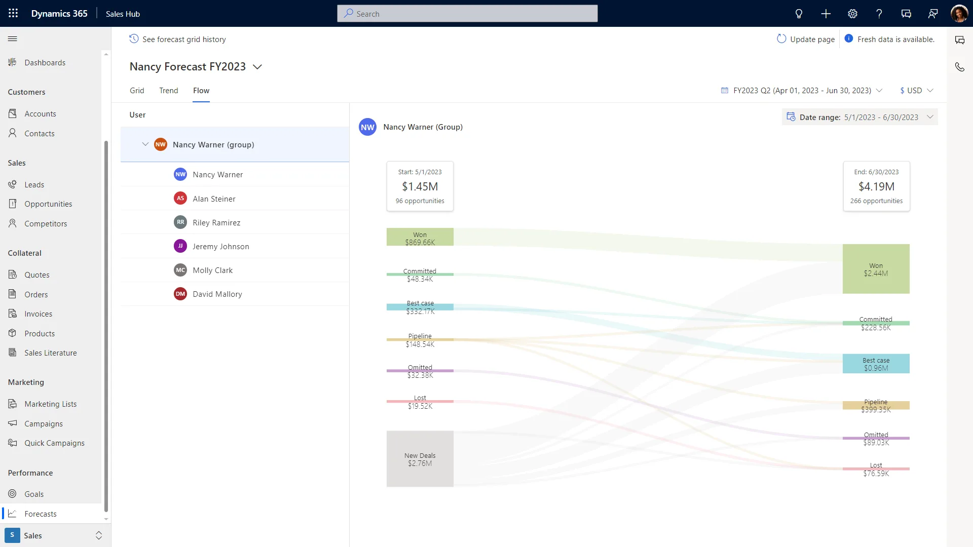
Sales, customer service, and marketing employees can craft their own dashboards in Dynamics 365, called user dashboards. You can show up to 6 visuals in a dashboard, like a funnel, tiles, bar graph, pie graph, and stack bar graph.
Understanding Dynamics 365 Dashboards and Components
Dashboards in Microsoft Dynamics 365 provide a powerful solution for businesses to track and analyze data quickly and easily. They provide insights into customer trends, performance, and other metrics that can help organizations make more informed decisions and better serve their customers.
To create the most effective dashboard, it's important to understand the different types of dashboards available, as well as the components each type contains.
The three main types of dashboards are single stream dashboards, unified interface dashboards (multi stream dashboard), and interactive experience dashboards. Single stream dashboards are composed of one chart or graph that displays a single set of data points at once.
This type of dashboard is best suited for displaying larger amounts of data concisely without overwhelming the user with too much information at once.

Looking for CRM or ERP specialists?
Contact our team for a free consultation and discover our CRM and ERP solutions that can be customized for your business needs.
 Contact us
Unified interface dashboards are composed of multiple charts or graphs that are organized into sections on one page. They're usually used when more than one set of data needs to be shown on a page (such as sales details by region). Interactive experience dashboards allow users to interact with the dashboard elements by using global filters, visual filters, tiles, and other components to customize their view according to their own needs and preferences.
For any dashboard in Dynamics 365, think about what type of charts or graphs you'll use, and how they'll look on the page. For example, a bar graph works well for comparing large amounts of data, while pie charts work best for small sets of information such as customer satisfaction ratings.
Also, web resources can be embedded on the dashboard page, so users can access all relevant information without switching between screens or applications. Global filters enable users to compare data across different time frames. They can use visual filters to see details about individual items in a chart or graph, such as product categories or customer types. Finally, the tiles show users key metrics quickly and easily.
By understanding how Dynamics 365 works, you can create dashboards that show your company's performance and success over time.
With this knowledge in hand, you can make sure that you are getting the most out of your Microsoft Dynamics system dashboard. A good dashboard setup gives you insights from every aspect, like sales figures per region or customer service feedback levels over time.

Designing an Effective Dashboard Strategy
Creating a successful dashboard requires planning and executing many steps. Here's a step-by-step guide on how to create an effective dashboard strategy for Dynamics 365.
1. Define Goals
The first step is to identify the key objectives for the dashboard. Identifying specific goals will help determine which metrics should be tracked and displayed on the dashboard. It's important to make sure that goals are realistic and achievable — if they're too ambitious, it can lead to frustration when results aren't achieved as quickly as expected.
2. Choose Data
Once you've established your goals, you need to decide which data points should be included on the dashboard. Each business will have different needs, so make sure that you include only those data points that are relevant to achieving your desired outcomes. Some common metrics include customer engagement, sales performance, customer satisfaction levels, and process timescales. However, this list isn't exhaustive. Depending on your individual needs, other data points may need to be considered too.
3. Identify Metrics
This is where you need to decide which metrics are most important for tracking progress towards achieving your goals. These should be clearly identified and tracked regularly for the dashboard strategy to be successful. The most important metrics will vary from company to company. Understanding which metrics are most important can help guide decisions about what data should be included in the dashboard and how it should be displayed.
4. Decide Chart Types & Visualization Elements
Now that you know which metrics to track, decide how to show this information on the dashboard. This can be done by choosing the right chart type (like a bar and column charts or pie chart) and adding other visual elements like colours or icons. Different chart types offer different benefits. Users get the most value from dashboards if they know how each one excels at what it does. This way, they can use the information quickly and accurately when needed.
5. Establish Best Practices
It's also worth considering best practices when designing a Dynamics 365 Dashboard strategy — such as how often data should be updated or reviewed? What security measures need to be considered? How can users access the information quickly and easily? Consider how users use dashboards to get relevant information without losing security or privacy.
6. Decide Who Needs Access
Lastly, consider who needs access — who should have permission to view or edit certain parts of the Dashboard? Is there any sensitive information that certain people don't need access to? Having clear policies around who has access helps protect confidential data while making sure users have no difficulty accessing relevant information when required
Creating a New Dashboard in Dynamics 365
Constructing a new dashboard in Dynamics 365 doesn't have to be complicated. Users just need to go to the "Dashboards" menu and select "new".
Once there, they may choose to create a Dynamics 365 Dashboard or a Power BI Dashboard. Before setup, think about how you want your dashboard to look and what the important user interaction points are.
For those seeking more sophisticated visuals than Dynamics 365 offers, Microsoft's Power BI may be integrated with D365 for advanced analytics capabilities.
This includes creating custom visualizations and leveraging machine learning algorithms for predictive insights. With this powerful tool, users can tailor interactive visuals and create charts that best suit their needs.
By taking these steps into account and implementing them accordingly, businesses can craft an efficient dashboard strategy. Dashboards can then meet individual requirements while offering meaningful insights into metrics tracking performance and customer satisfaction ratings.
Liked what you just read? Sharing is caring.

April 23, 2025 by Kooldeep Sahye by Kooldeep Sahye Marketing Specialist
Fuelled by a passion for everything that has to do with search engine optimization, keywords and optimization of content. And an avid copywriter who thrives on storytelling and impactful content.

